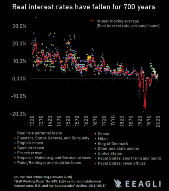
I’m about to show you one of the boldest, strangest financial images I have ever seen.
To be honest with you, I’m still not entirely sure what to make of it. When I first came across it, I laughed aloud at just how ambitious it is. It is an attempt to distil seven centuries of financial history into one metric – into one line, in fact.
It is, at the very least, a fascinating image – a curiosity that investors would do well to mull over. If we assume it is totally correct in its assumptions however, then this could be one of the most important charts you will ever witness.
A little context first though. A while back in this letter I asked you what assets you’d buy if you ran a sovereign wealth fund (Kissing $1 trillion goodbye – 31 October 2019).
Running such a fund presents a unique challenge for an investor, for such funds have no specific investment horizon.
They are not being run in the anticipation that one day they will be wound up and dissolved to support consumption, like a personal pension pot. They have no expiry date, no set or anticipated time when they will distribute their capital back to their owners. All they can focus on is making money for the ultra-long term. A bit like a pension fund, but for an immortal with no need of taking a pension.
This need to keep on making money with no exit date in sight forces such funds to take incredibly long-term investment decisions, while exercising significant caution. We explored some of those last year, spurred on by the resignation of Yngve Slyngstad, the “trillion-dollar man” in charge of Norway’s sovereign wealth fund.
Yngve almost timed his exit perfectly, nearly dodging the WuFlu madness with his resignation. But alas, he must stay on at the helm until September, when his successor arrives. He’ll be leaving on a hell of a note – whether it’s a high or a low one, we’ll see.
But the topic of investing for the very long term – indeed, for longer than your own life – came to mind again when I looked at this chart I mentioned earlier.
This contains 700 years of human existence – different nations, cultures, rulers, epochs, financial regimes and currencies – in one line. It goes without saying that money, finance, and economics have changed an awful lot in that time.
But what’s striking is that not only does this chart attempt to contain such a vast tract of human existence in one image, but it makes the case that there’s one trend that has been constant all the way through; a force which has a huge effect on the economy and your investment returns…
For 700 years, this chart argues, the cost of borrowing and the interest that can be earned on savings – when you adjust for inflation – has been going down.
Or to put it another way, real interest rates have been declining for seven centuries, and the wild place we stand now with near zero interest rates nearly everywhere in the developed world is really just par for the course.
 Source: The Market Ear
Now, I’m slightly sceptical that all of that inflation and interest rate data since the 1300s can be trusted and distilled into such a straightforward line going down – but that aside, this is a fascinating depiction of financial history. And if you do trust it, this is one of the strongest arguments for owning gold.
Gold does the opposite of real interest rates: when real rates go down, gold goes up, and vice versa. This is because gold becomes more valuable when you can’t earn risk-free interest either at the bank or in assets that are perceived to be safe, like government bonds.
There’s less of a reason to lend your money to such institutions when they’re not paying you much for the favour – so many investors just hold gold to protect their purchasing power. Gold may not pay any interest, but that doesn’t matter if nobody else is either.
If real rates have been declining for centuries now (the cause of which can be debated, but that’s for another letter) and if we expect the trend to continue, it lends an inevitability to the prospect of a much higher gold price in the future. Nobody invests with a 700-year investment horizon, but this is one of the few assets that wouldn’t be out of place in an immortal’s pension fund.
Back tomorrow,

Boaz Shoshan
Editor, Capital & Conflict
PS Lockdown again? It certainly is for my hometown in Aberdeen. In fact, a buddy of mine, a barman, is pretty sure he’s got the WuFlu now and is self-quarantining. He’s the first fella I know from back home to have had any symptoms (while I know plenty who’ve experienced them in London). As I’m sure you’re aware, the last batch of lockdowns whacked the stockmarket for six – but what happens if we get a “second wave”? Nick Hubble has an idea, and it ain’t pretty…
Category: Investing in Gold

