The US is the world’s biggest economy (still). So the state of its employment market is important to investors. More jobs means more spending, means more growth. If employment is falling, on the other hand, it’s not good for the economy.
That means people pay a lot of attention to the key employment release – the monthly non-farm payrolls figures. But we think there’s a superior indicator to use – and it’s updated weekly.
It’s the US initial jobless claims figures, which were released earlier today. These tell us how many Americans are claiming state unemployment benefits for the first time. History shows these claims have been a good guide as to what’s going to happen to the US economy.
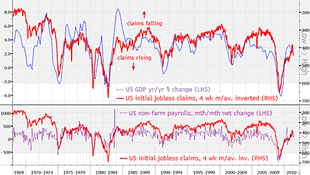
For the week to 21 May, initial jobless claims rose 10,000 to 424,000. That’s worse than expected: the Bloomberg economists’ survey forecast a drop to 404,000. Meanwhile, the four-week moving average of these claims, which filters out the weekly ‘noise’, making it a better indicator of the overall trend, dipped slightly. But at 439,000 it’s still high – as these charts show…

Source: Bloomberg. Click on the chart for a larger version
The red line on both is the inverted four-week moving average of US initial jobless claims. In short, the higher this line moves on both charts, the fewer claims are being submitted. So a rising red line is good news, and vice versa.
On the top chart, we’ve compared averaged jobless claims against GDP growth. On the lower graph, we logged them against the more widely watched non-farm payroll numbers.
Clearly, averaged jobless claims win hands down as a much more reliable and less volatile indicator (look at how spiky the pink line is compared to the red one). But more importantly, the latest figures are warning that the outlook for the overall US economy is getting worse again.
Category: Economics

