BALTIMORE – The Davos crowd was told that the world economy is minting one new billionaire every two days…
Eighty-two percent of the world’s wealth generated last year went to the “One Percent.”
That leaves 18% for the bottom 99%. Many of the 99 percenters must have gotten nothing at all… or less than nothing.
Squirrely Numbers
Numbers are always a little squirrely. Give them a bribe or threaten them with violence, and they’ll say practically anything.
But, spontaneously, more and more numbers are coming forth and bearing witness against a fraudulent economy.
They tell us that the feds’ GDP calculations are not to be trusted…
Looking at the economic picture in the U.S., we are meant to see happy people getting richer, with a bubbly stock market, low consumer price inflation, and jobs for whomever wants one.
That is the picture the news media, the financial press, Wall Street, and the Trump administration draws.
But what we see is claptrap. The dots don’t connect.
In a labor pool with barely any increase in average wages, if some wages are going up, other wages must be going down.
And in a country where growth is concentrated in a few urban-suburban conglomerates – Washington, D.C., New York, San Francisco, etc. – there must be a lot of places where people are not drinking cappuccinos, sending their children to private schools, or listening to NPR.
Illusory Growth
In the bottom half of the U.S. population, 117 million adults earn an average annual wage of $16,000 a year.
These people are worse off than they were at the end of the last century… and probably worse off than they were when the Fake-Money Era began in 1971.
But we’ll let you draw your own conclusion.
We asked our research department, headed by the able Joe Withrow, to comb through the U.S., county by county, and tell us where people were better off… and where they weren’t.
His report can be read in full here. You should read it. The assumptions and analytical methods he used are important.
In addition to the expected evidence came a revelation: GDP growth is largely counterfeit.
Economic Botox
We’ll get to that in due course…
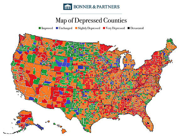
First, here are the highlights of Joe’s report… including a map:
 For a full breakdown of this map, be sure you read the full special report.
The economy is cranking out more jobs… more money… and more stuff.According to the Bureau of Economic Analysis (BEA), wages have risen 36% since the 2008 financial crisis. The jobless rate has been cut in half. And GDP has grown 20%.
America is back!
Or is it?
Per Joe:
The U.S. is a diverse nation of 325 million people. It’s composed of 50 states. Those states are composed of 3,141 counties. And those counties are very different from one another… as are the people who live in them.
But the BEA ignores this in its analysis. Instead, it rounds up economic statistics from all over the nation. Then it picks out the averages… and puts makeup on them. It smooths out their wrinkles and evens out their complexions.
GDP includes “all private and public consumption, government outlays, investments, private inventories, paid-in construction costs, and the foreign balance of trade.”
Can you spot the problem?
GDP measures include government outlays… but those outlays exceed tax receipts by a wide margin every year.
So, a portion of government outlays are financed by money created from nothing… and that is picked up as “growth” in GDP.
The people receiving that money then spend it on something… which is picked up in the “private consumption” part of GDP.
That means GDP records the Fed’s fake money as “growth” – twice.
By the way, government transfer payments have exploded by 45% since the 2008 financial crisis. And GDP metrics have captured every single penny of that as “growth.”
Depressed Counties
At Bonner & Partners, we pass no judgment. Old… young… fat… lazy – we don’t care how attractive your county is. We just want to know what it looks like before the feds doll it up.
Joe continues:
The map reveals that people in 2,278 counties have gotten poorer over the past 10 years. As best we can tell, that means 73% of U.S. counties are in a depression.
Let’s look at each of our metrics. Over the past 10 years:
- Unemployment has risen in 56% of counties
- The labor force participation rate – which tracks the number of Americans either working or actively looking for work – has fallen in 60% of counties
- The poverty rate has increased in 87% of counties
- Inflation-adjusted wage growth has decreased in 98% of counties
What is most surprising to us about this study is that even in counties where the Deep State and its crony industries are in full flower, most people are withering.
Could that be true? Could nearly three-quarters of U.S. counties really be in depression? And what does GDP really mean?
More to come…
Regards,
![]()
Bill
Related Articles:
Category: Economics

